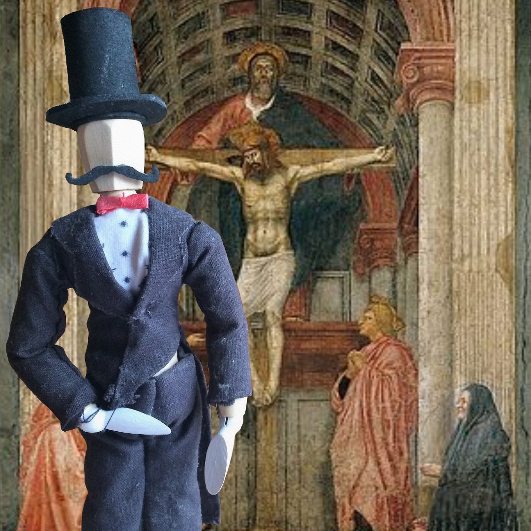
Sylvester is going to take us to Florence today. Get ready for the gelato!
Florence, in addition to being responsible for lots of great dessert today, is also home of some of the greatest art in the world. It’s particularly famous for Renaissance art. In that time, there was actually a community of great artists there, including Donatello and Brunelleschi. But on to this piece.
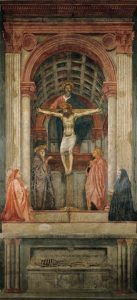
Masaccio was an artist in Florence in the 1400’s, and he’s credited with having revived painting there. This fresco of the Holy Trinity is possibly his most famous work. It’s located at Santa Maria Novella.
What do we see in this picture? (Sylvester says everyone who has ever taken art history is tired of this question. Get over it. I have no other questions to ask.) Well, the focus of the picture is Jesus hanging on the cross, the Holy Spirit alighting just over His head, and God the Father behind them. The Father is represented as more physically present than in most art; we actually see more of His body than usual (normally it’s just His head or something). We also see Saint John and Mary at the foot of the cross, and outside the central picture, Masaccio has painted the donors. Sylvester says they weren’t holy enough to be part of the picture. I told him they just weren’t actually there.
See that skeleton at the bottom? There’s a really cool quote just above him that translates, “What I once was, you are; what I am, you will become.” That sounds like it could be morbid, but it’s considered to be a message that faith in God will overcome death.
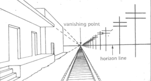
Brunelleschi, an artist of the time who had a significant impact on architecture in churches, had theories about church architecture taking into account proper proportions for the given size of the building. So the bigger the building, the bigger the pillars–not just because they could hold it up, but because it would look right. He also invented the idea of linear perspective, something now taken for granted by artists but which was a major breakthrough of that day. It’s a method of calculating exactly how to draw things as they get farther and farther away from you into the distance, and it tells you how much smaller to make them. For instance:
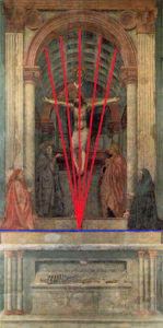
Masaccio’s Trinity fresco is one of the first major works of art to incorporate correct perspective into it. In the past, artists may have been able to tell that the roofs of buildings looked lower as they got farther away, but there wasn’t really any understanding of exactly how to draw that. You just had to be REALLY good at observing, and some were but most didn’t quite nail it. Now Masaccio could. Notice in this picture from Khan Academy the way the rafters in the church come back to that vanishing point, correctly implementing the ideas of linear perspective:
This does not simply make it technically correct. It adds depth. It makes the scene believable and lets you enter the space. It gives your eyes a direction to go, and you can focus on the points that really matter, undistracted by visual inconsistencies. Instead, the composition, the direction of the lines, and the placement of the characters let you experience those characters.


